SU New Colors, Paper, & Products!

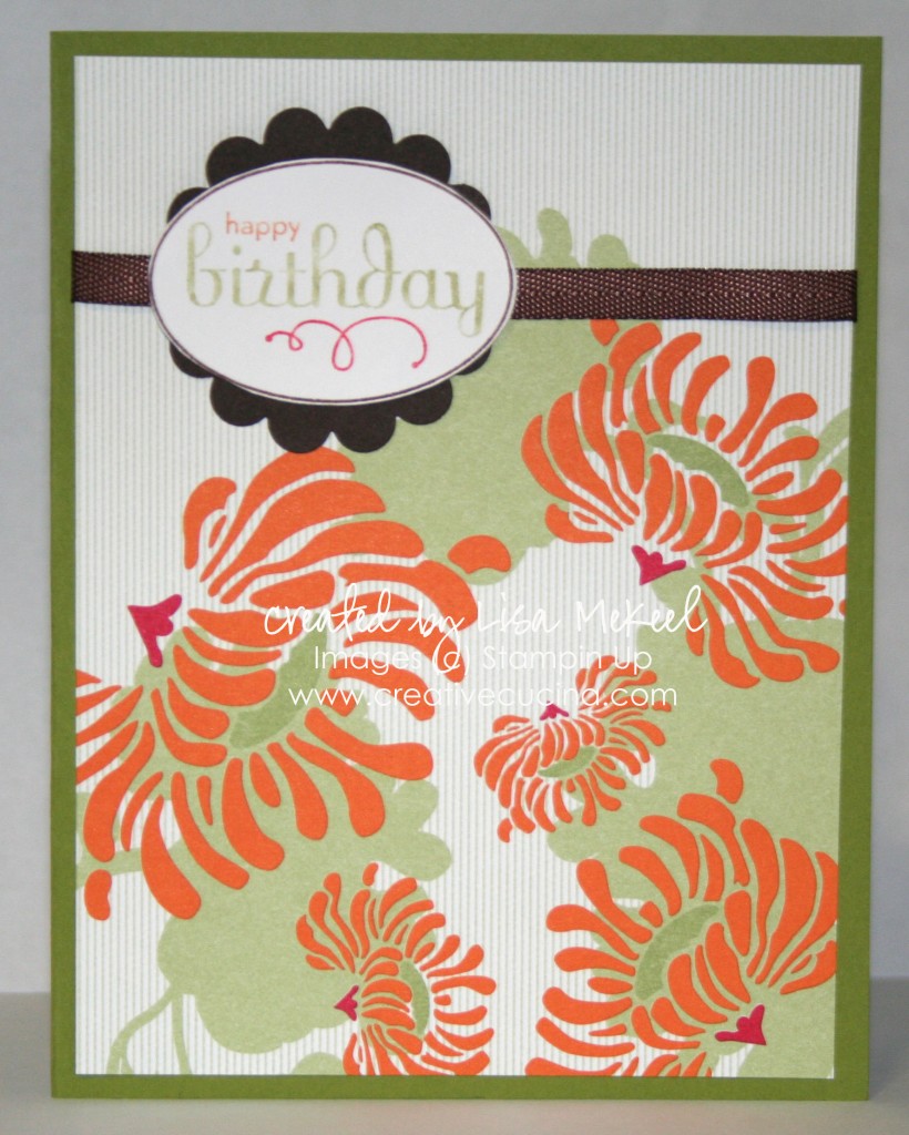
I’m a big fan of using DSP as the main image of a card. This paper is from Greenhouse Gala, available July 1st. It’s got a lot of great colors, graphics, and designs.

Here, I used Old Olive card stock for the base, layered it with a 4″ x 5 1/4″ piece of DSP and used another new stamp set called Perfect Punches for the sentiment. I used the new In Colors to color in the stamp: Pear Pizzazz, Poppy Parade, and Peach Parfait. This stamp coordinates with the Wide Oval Punch. I then layered the oval onto Early Espresso (another new core color) that I punched with the Scallop Circle Punch. Behind that, I added some Chocolate Chip 1/4″ Twill Ribbon (retired).
Slide Out Gift Card Holder {Buttons & Baby Ducks}

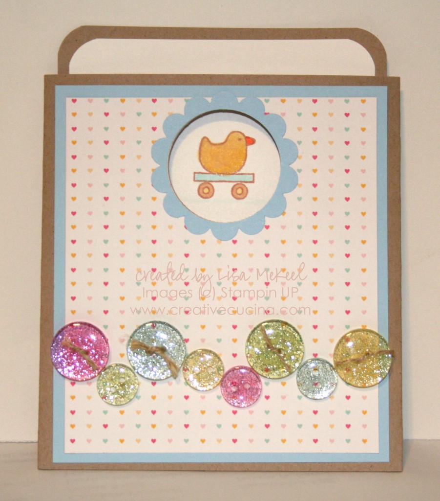
I absolutely LOVE this style of card. It’s a slide out/pocket card that works really well for gift cards. I’ve made this style of card before, which you can see here. You can also view a video tutorial here.

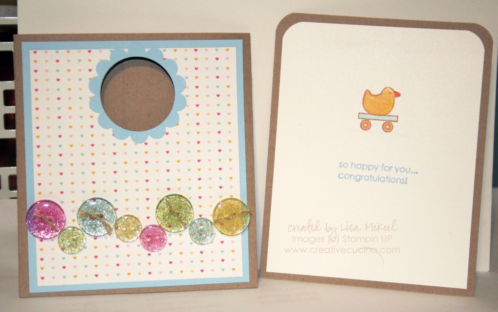
The basics: Card stock for the base is Kraft (soon to be called Crumb Cake), Bashful Blue, and Welcome Neighbor DSP. Slider/Insert is Kraft layered with Whisper White. I rounded the edges of both layers using the Corner Rounder. To make the “window” on the front, I used the 1 3/8″ Circle Punch and Scallop Circle Punch.

Here is the slide out portion. It’s a little difficult to see in the picture, but the reason this works so well for gift cards is the Slit Punch. I punch the slit toward the bottom of the card, and a gift card slides in there perfectly.

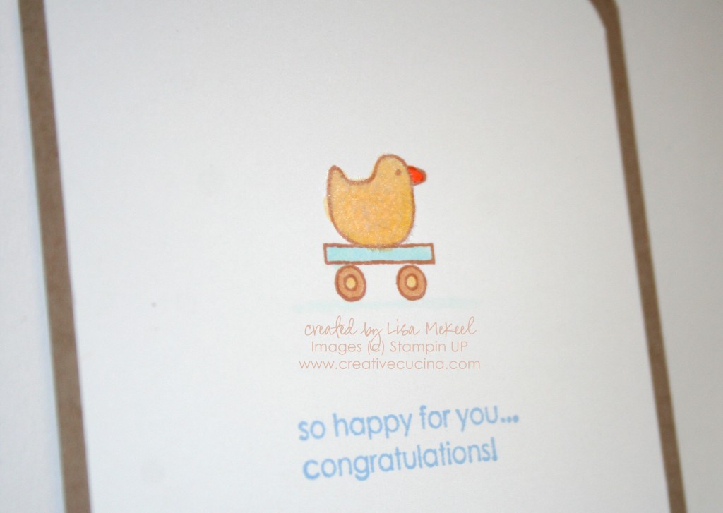
I stamped the little duck from Goody Goody Gumdrops in Creamy Caramel ink, colored it in with Copic Markers, and then fluffed it up by adding Martha Stewart White Flocking Powder (using the 2 Way Glue Pen to adhere the Flocking Powder). The sentiment is from the same set, stamped in Bashful Blue ink.

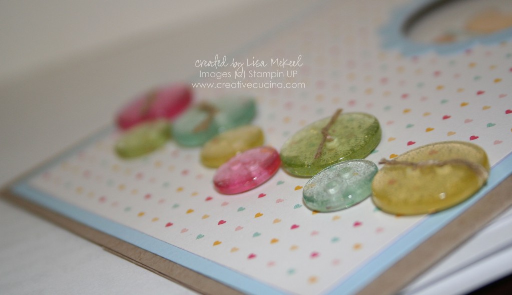
These buttons from American Crafts–can we just admire the buttons for a minute? I threaded the larger ones with Linen Thread and attached them to the card with Glue Dots. They’re glittery and the colors go so well with the Welcome Neighbor DSP Pack.

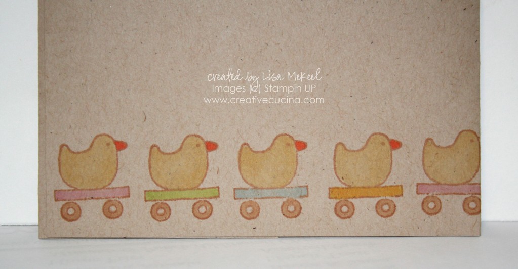
Finally, I decided to liven up the back of the card a little by stamping the ducky repeatedly along the bottom edge. I colored them in with Copic Markers and I was surprised to see the colors showed up so well on Kraft colored card stock! Now that I know this works, I’ll have to try it more often.

Flower Fancy {Distressed Look}

This style is not my strong suit, but there is so much of the vintage/distressed look going on lately that I figured now is probably the best time to try it.

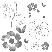
I had my eye on this Fancy Flowers stamp set for a while, and when it went on sale last month, I had a chance to buy it for 20% off!

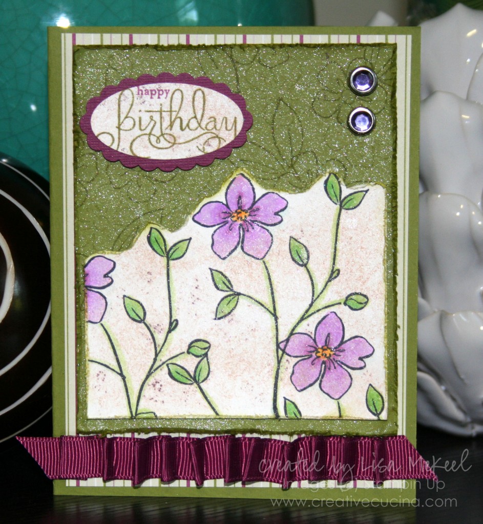
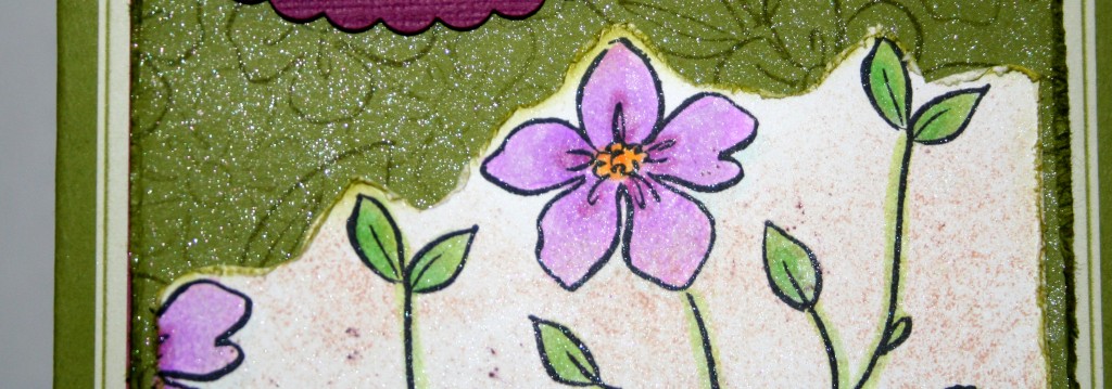
While I originally was drawn to the large flower image, I decided to try the flower and stem image first. I stamped it a few times on Gina K Luxury White card stock in Memento Black ink and colored it in with Copic Markers.

Next, I cut along the top of the flowers, just following along the image, with my scissors. Since this is a “distressed style” card, I used the Distressing Tool along all the card stock edges, going back over the distressed edges with Old Olive ink and a Sponge Dauber. Then, I sponged some Creamy Caramel ink all over the White card stock using a sponge that happened to have some old Chocolate Chip Reinker/Champagne Shimmer Paint on it. The darker brown spots were just a happy accident as a result. Finally, I spritzed some Frost Shimmer Mist (Frost Shimmer Paint mixed with 70% Rubbing Alcohol) all over the card stock.

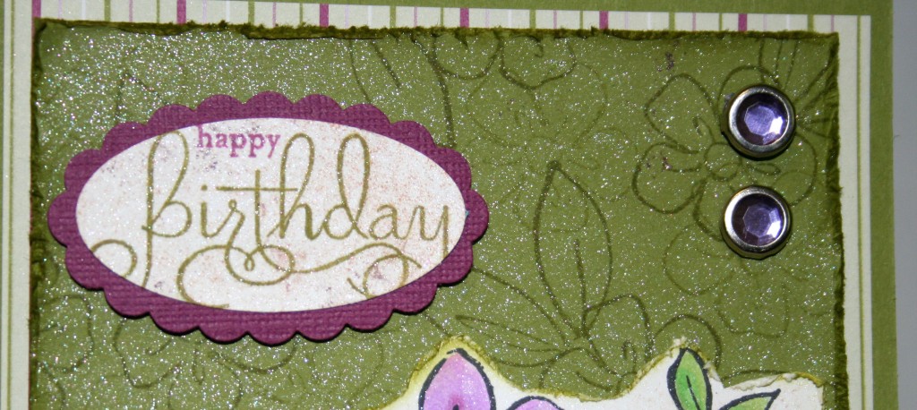
Behind that, I randomly stamped the small flower and leaves in Old Olive ink (stamping off first) on Old Olive card stock. That was also distressed using the same method described above, minus the creamy caramel. I also sprayed it with Frost Shimmer Mist. In the upper corner, I added 2 Circle Rhinestone Brads in purple, and the sentiment is from Well Scripted, stamped in Rich Razzleberry and Old Olive Marker on Whisper white that I “distressed” with sponges and Shimmer Mist. Then, I punched out the “Happy Birthday” with the Large Oval Punch and layered it onto Rich Razzleberry textured card stock, punched with the Scallop Oval Punch. I adhered it to the base with Stampin dimensionals.

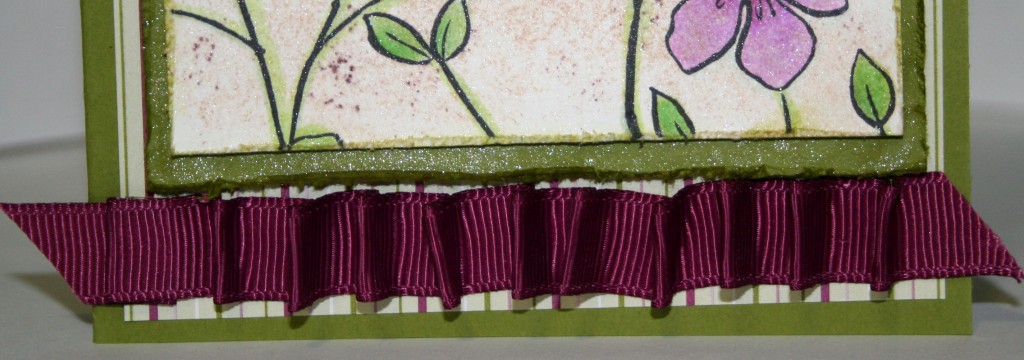
The striped paper is from Cottage Wall DSP, which I layered over the Old Olive card base. At the bottom of the card, I added a little Rich Razzleberry Grosgrain Ribbon. The “pleated” look was easy to do, simply by putting Sticky Strip along the length of the ribbon and then folding it into pleats.

Bad Behavior has blocked 472 access attempts in the last 7 days.

css.php