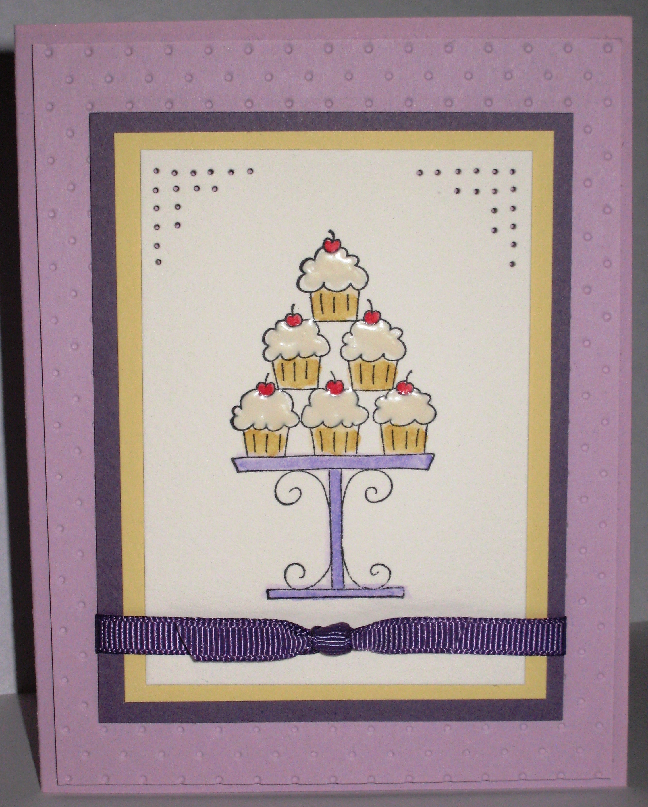
Purple Cupcakes

Looking back over my projects, I came to the realization that I always use the same colors. Chocolate Chip anyone?? I’m trying to branch out, and Purple is branching WAY out for me. I may have made 3 purple cards in my lifetime. I can’t think of any of them right now, but I’m guessing I had to make at least that many in the 3 years I’ve been doing this!

Here, I used 2 purples–I know, crazy! The card base is Pale Plum. I cut a piece of Pale Plum 4″x5 1/4″ and ran it through the CB using the Swiss Dots embossing folder. Then, I adhered it to the card base using dimensionals with the raised side down. Sometimes those raised bumps gross me out a little. This way is much less creepy for me!

The image is from Crazy for Cupcakes stamped in Black Stazon on watercolor paper. I “watercolored” with my Markers (see my favorite tutorial here) and used White Liquid Applique on the cupcakes to frost them. I just applied the Liquid Applique and let it dry overnight. If you heat set it, it will puff up like marshmallow. The watercolor paper is layered with So Saffron card stock and Perfect Plum. I paper pierced the corners and tied a piece of Perfect Plum 1/4″ grosgrain ribbon around the base.
No, I don’t knit…

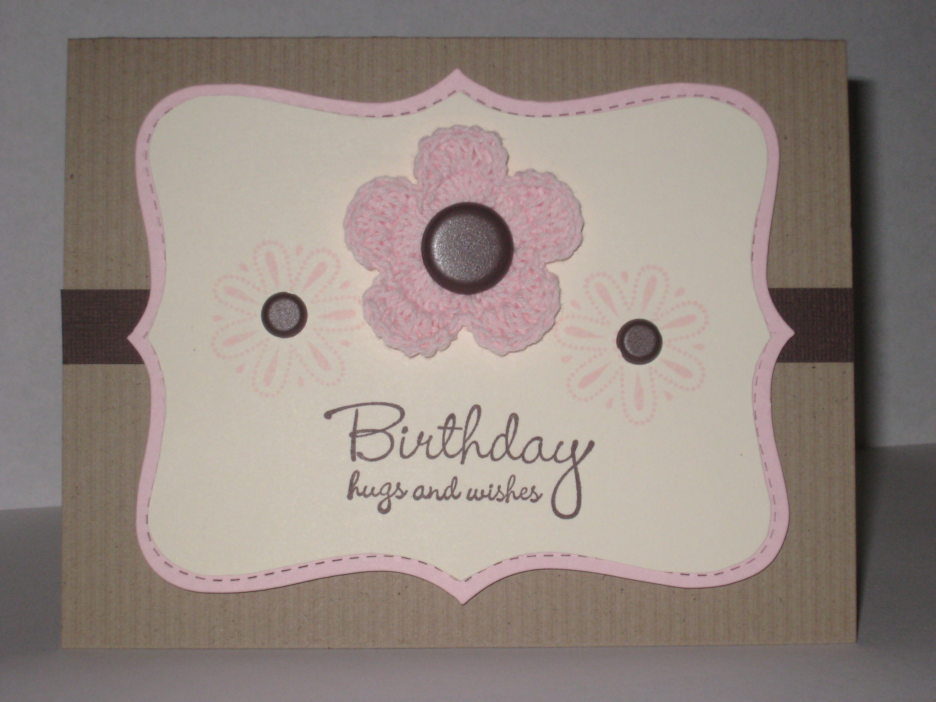
But these Fleurettes are so cute I may just have to learn. I was surprised at how much I liked the way this card turned out. Mostly because I used the SAB set Polka Dot Punches, which I was reluctant to get. It ended up coming in handy!

The card base is a piece of striped Kraft from Taste of Textiles. I’m on my second package People–this stuff is great!!! My Top Note Die got some use again for this card, once in Pink Pirouette and once in Very Vanilla, which I trimmed to layer with the Pink. On the Very Vanilla layer, I stamped the flowers from Polka Dot Punches in Pink Pirouette Ink. Then I used my crop-a-dile to punch holes in the center of each for the Basic 5/16″ Brads in Brown. The large pink Fleurette  was attached to the Vanilla layer using my crop-a-dile again, but this time, a 5/8″ Basic Brown Brad was placed in the center.

The sentiment is one of my favorites, from Hugs and Wishes, stamped in Chocolate Chip ink. Behind the Top Note is a strip of Chocolate Chip Textured Cardstock to help balance the look.

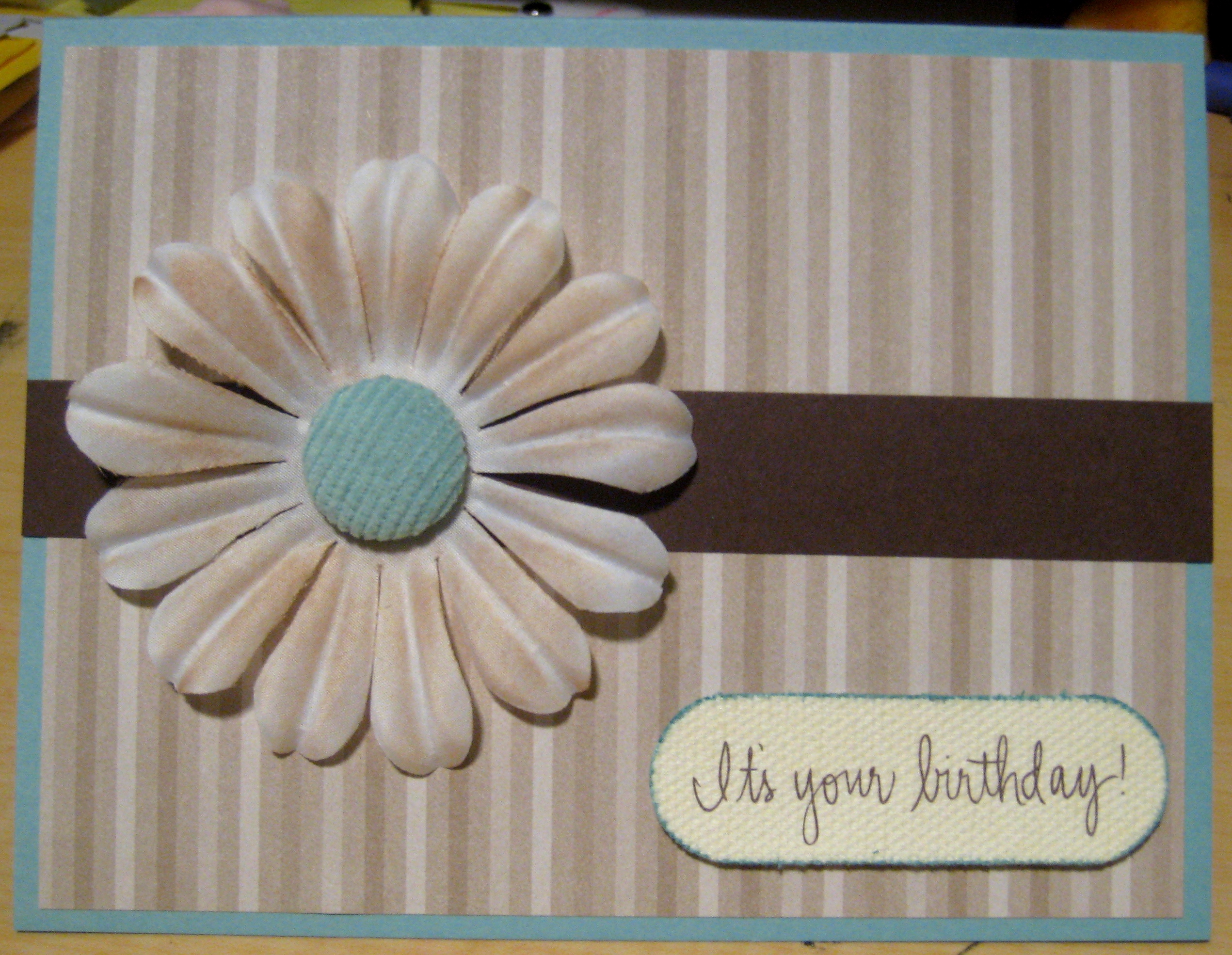
Pretty Daisy

A very simple card. DSP is from Urban Oasis, mounted on a piece of Baja Breeze card stock. I put a strip of Chocolate Chip card stock across the center, and a flower from the Pretties bulk kit that I sponged with Creamy Caramel anchors the left side. In the center of the flower, I used a Baja Breeze Corduroy Brad. The brads have a tendency to slide down, so I put glue dots behind it to adhere it flat against the flower.

The sentiment is a rub on from Fashion District–I love that font! I used this oval shaped Canvas Cut and swiped the edges in Baja Breeze ink before applying the rub on. The canvas cut is adhered to the card base with dimensionals.

I may end up doing more to this card eventually, but for now I’m going to leave it as is and add it to my stash of ready to go birthday cards. Which reminds me, I am in serious need of masculine birthday cards! I don’t own any “manly” stamps so if anyone has any suggestions, I’m all ears. What do you like to use for masculine birthday cards?

Bad Behavior has blocked 948 access attempts in the last 7 days.

css.php